


DISCIPLINE(S):
DISCIPLINE(S):
DISCIPLINE(S):
BRANDING
BRANDING
BRANDING
DIGITAL MEDIA
DIGITAL MEDIA
DIGITAL MEDIA
MARKETING
MARKETING
MARKETING

Curiosity and visual storytelling shape my approach to design.

I’m driven by exploring ideas through design and creating work that connects with audiences in meaningful ways.
I’m driven by exploring ideas through design and creating work that connects with audiences in meaningful ways.
Paragraph
Paragraph
My approach is shaped by curiosity and visual storytelling, beginning with analogue experimentation and sketching before developing ideas into considered digital outcomes.
My approach is shaped by curiosity and visual storytelling, beginning with analogue experimentation and sketching before developing ideas into considered digital outcomes.
TOP 3 PROJECTS.
TOP 3 PROJECTS.

Coventry City Football Club (CCFC) Programme Cover Design, 03/26
Coventry City Football Club (CCFC) Programme Cover Design, 03/26
Coventry City Football Club (CCFC) Programme Cover Design, 03/26
This project was created during a one-day placement at Coventry City F.C.’s Coventry Building Society Arena in response to a live brief with Coventry University. The aim was to create experimental matchday graphics beyond traditional player posters.
This project was created during a one-day placement at Coventry City F.C.’s Coventry Building Society Arena in response to a live brief with Coventry University. The aim was to create experimental matchday graphics beyond traditional player posters.
This project was created during a one-day placement at Coventry City F.C.’s Coventry Building Society Arena in response to a live brief with Coventry University. The aim was to create experimental matchday graphics beyond traditional player posters.
Using geometric patterns, layout, and letterpress textures, I explored movement, energy, and atmosphere while reflecting the identity of the club and city. Selected designs featured in official matchday programmes.
Using geometric patterns, layout, and letterpress textures, I explored movement, energy, and atmosphere while reflecting the identity of the club and city. Selected designs featured in official matchday programmes.
Using geometric patterns, layout, and letterpress textures, I explored movement, energy, and atmosphere while reflecting the identity of the club and city. Selected designs featured in official matchday programmes.

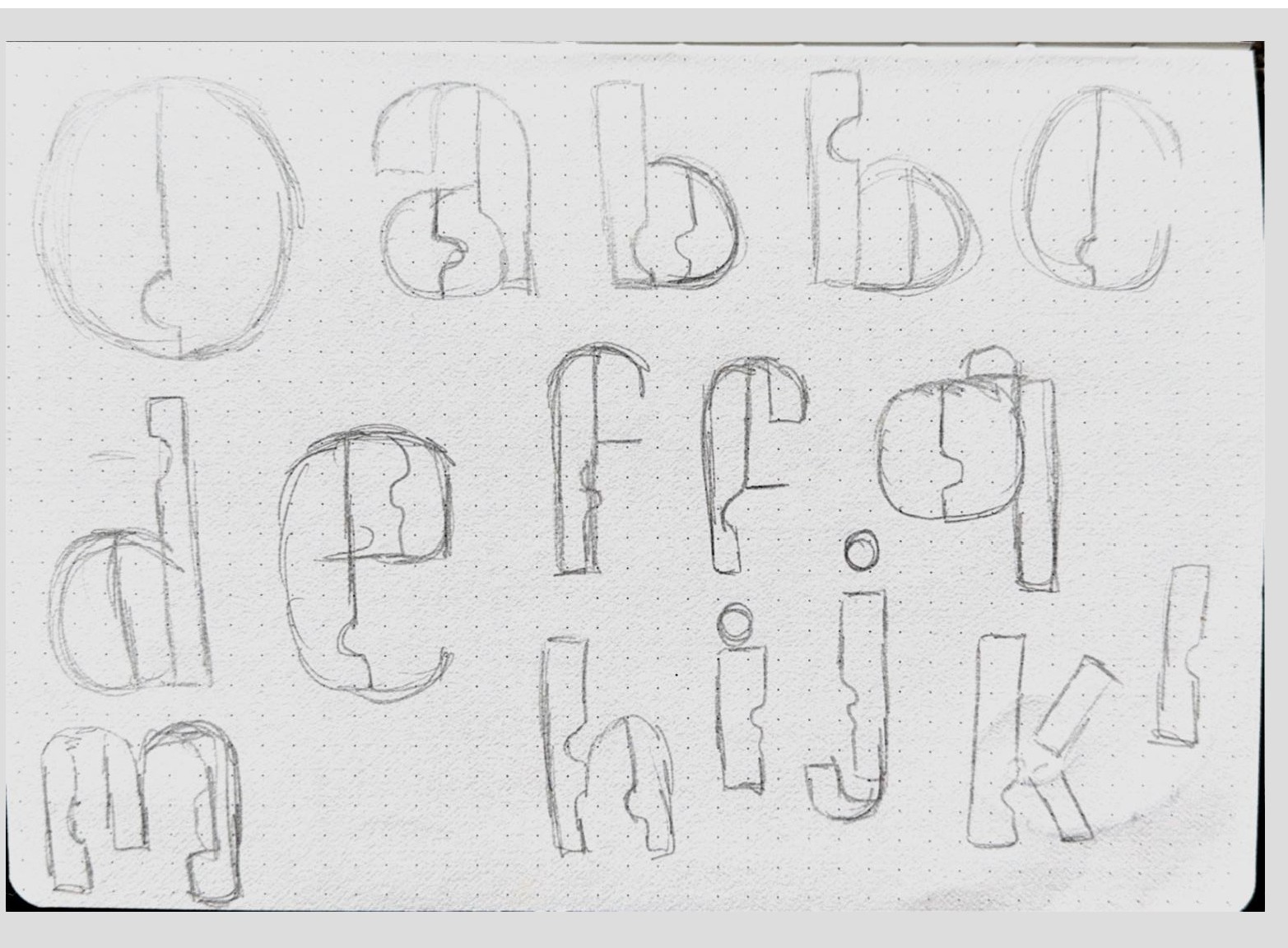
Radiophonic Typeface, 11/24
Radiophonic Typeface, 11/24
Radiophonic Typeface, 11/24
Radiophonic is a display typeface inspired by the experimental electronic music of Delia Derbyshire. After researching her work at the BBC Radiophonic Workshop, I began developing letterforms influenced by the textures and processes behind analogue sound production.
Radiophonic is a display typeface inspired by the experimental electronic music of Delia Derbyshire. After researching her work at the BBC Radiophonic Workshop, I began developing letterforms influenced by the textures and processes behind analogue sound production.
Radiophonic is a display typeface inspired by the experimental electronic music of Delia Derbyshire. After researching her work at the BBC Radiophonic Workshop, I began developing letterforms influenced by the textures and processes behind analogue sound production.
The shapes of the glyphs take inspiration from vinyl records and cut-out forms, reflecting the layered and experimental nature of Derbyshire’s music. The final outcome is a bold display typeface that visually translates sound into typography.
The shapes of the glyphs take inspiration from vinyl records and cut-out forms, reflecting the layered and experimental nature of Derbyshire’s music. The final outcome is a bold display typeface that visually translates sound into typography.
The shapes of the glyphs take inspiration from vinyl records and cut-out forms, reflecting the layered and experimental nature of Derbyshire’s music. The final outcome is a bold display typeface that visually translates sound into typography.

HSBC
HSBC
HSBC
The brief explored how HSBC connects people, cultures, and opportunities worldwide. Using landmark-based posters, I created a visual journey linked by a flowing white line symbolising movement across borders.
The brief explored how HSBC connects people, cultures, and opportunities worldwide. Using landmark-based posters, I created a visual journey linked by a flowing white line symbolising movement across borders.
The brief explored how HSBC connects people, cultures, and opportunities worldwide. Using landmark-based posters, I created a visual journey linked by a flowing white line symbolising movement across borders.
HSBC’s red anchors each composition, reinforcing brand presence. The outcome uses minimal, impactful design to communicate a complex global network clearly and recognisably.
HSBC’s red anchors each composition, reinforcing brand presence. The outcome uses minimal, impactful design to communicate a complex global network clearly and recognisably.
HSBC’s red anchors each composition, reinforcing brand presence. The outcome uses minimal, impactful design to communicate a complex global network clearly and recognisably.
MY PROCESSES.
MY PROCESSES.


My design process usually begins with research and collecting visual references to help shape the direction of a project. I tend to start working in a more analogue way, using sketching, note-making and rough ideas on paper to explore different concepts before moving into digital design.
My design process usually begins with research and collecting visual references to help shape the direction of a project. I tend to start working in a more analogue way, using sketching, note-making and rough ideas on paper to explore different concepts before moving into digital design.
This early experimentation helps me test layouts, typography and visual approaches quickly. I then refine the strongest ideas digitally, developing them further through feedback and workshops. Through this process of experimentation and refinement, I aim to create work that is thoughtful, well resolved and visually engaging.
This early experimentation helps me test layouts, typography and visual approaches quickly. I then refine the strongest ideas digitally, developing them further through feedback and workshops. Through this process of experimentation and refinement, I aim to create work that is thoughtful, well resolved and visually engaging.


